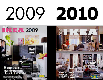
The outrage caused by Ikea's recent typeface debacle is fairly justified. If you haven't heard, Ikea have chosen to change their corporate typeface of 50 years from the iconic Futura to [drum roll please] ...Verdana?!
Not sure what happened there, but Ikea explain that it was abandoning its own version of the Futura font because it wanted one that would be effective in many different languages and on the Web, and that Verdana was designed for just that purpose.
Personally speaking I think it shows a lack of understanding on their part, about the importance of appropriate typography. I know Ikea is about cost effectiveness - but that cheap efficiency should perhaps stop at their products.
Some people however think it's a good thing, a visionary move by Ikea's design team perhaps, but quite frankly, I don't buy that.
So what do you think? Are we all being too precious? Does it even matter?
(Of course it matters!!)
Lastly, If do you care that much, get (flat)packing and sign the petition against the change!

No comments:
Post a Comment