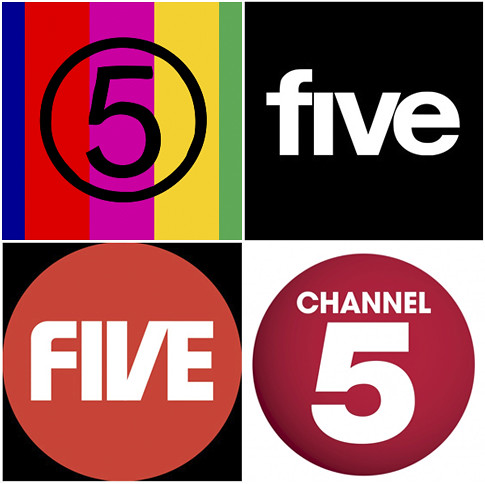
The last few years have provided us with a wealth of controversial, not to mention rather ugly identity refreshes, and the latest to report is the new Channel 5 identity (above image: bottom right). Yes, it's a bit of a shocker.
It seemed liked no time at all when we first saw Dixon Baxi's more than respectable effort compared to the last iteration. But of course that's to be expected in today's fast moving market; brands need to constantly evolve to reflect their current position and remain competitive. But you'd think that when some these big brands invest so much in all their other brand and marketing assets, they would at least consider the aesthetic a little more than they do. Perhaps there's an argument that the aesthetic achieves little more than vanity in the marketing world. To some extent that may even be true, but regardless shouldn't everything evolve to a better state?
Anyway, if you care to look back, here's a little Channel 5 brand history.
Via Guardian
