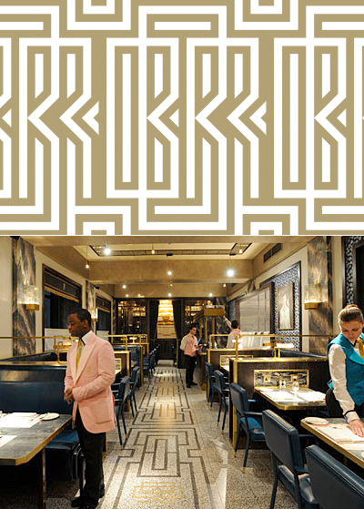
Whilst having breakfast at Soho's eccentric Bob Bob Ricard, a kind of Paris brasserie come New York diner, I couldn't help being suitably impressed by the deco inspired design and branding, not to mention the quirky highlights such as the individual toasters, the champagne button, or perhaps that waiters would wear pink and waitresses, blue; a bold move by uniform designers, Nouniform.
The owners were present at the time, washing the windows no less (obviously not afraid of mucking in), and we seemed to recognise certain design similarities with other places like the Wolseley and Claridges. A chat with the manager revealed a few things about BBR, but for our attention, the fact that David Collins Studio had been responsible for the award winning design, had made much sense. (There are some images on the David Collins site, bit of shame you need a client login-in to see more.)
Anyway if you get the chance, try it out and look around.

No comments:
Post a Comment